The other day, my roommate (my sister actually, haha) asked me to make a bookmark for her. And this is what I came up with. Really nice. Kinda jealous seeing her using and now I'm off to do one for myself. Haha...
 This is a card I made for my cousin, Nona, last September, before she flew off to UK. Out of all the cards that I had made so far, this is my most favourite one. So vibrant...I loike! Maybe this is because I'm used to use the same colour scheme for my pieces but for this one, I gambled and used lots of colours. The front cover for example, use three pieces of paper that is kinda contrasting. One is blue, another is pink and the other one is stripey green. It sounded like disaster, right? But here, it works! And I love the way I did the 'Good Luck' bits. Blue and yellow can never do wrong in my book...
Basically, the card opens up to reveal more. The first thing you will see when you open it up is a poem, which I got off the net, like usual. Then, it opens up to our wishes to Kak Nona. The last two pictures show that bit... And you know the best thing about this card? It can double up as a wall-hanging thingy.Don't know if you notice or not but at the topmost picture, you can see the gold ribbon there it can be used to hang the card on the wall. Nice eh? When I first finished this one, I fell head over heels in love with it that I never wanted to part with it. :)
 Kak Su gave me and Yana her autograph book yonks ago (last August I think) and Yana had written her part already. I kept the book until now and felt that it is time for me to finally write my part. And this is what I came up with. For me, this is just okay. When I finished this, I was wondering why the hell I did not use any patterned paper eh? It would have been nicer with little bits of patterned paper, I think. The uppermost one is basically my name, address and phone number, all blurred due to privacy. Haha! The below one is folded accordian-style and can open up to reveal more. The 'Read On' is a sticker. I added the paper clip, ribbon and the pressed flowers because the page is too bland for my liking.
What I had written was: Hidup ini ada warna-warni yang terlakar pada kanvas. Walaupun tidak cantik, ia tetap membawa sejuta makna.

The first one is titled Family. Has hidden journaling. Sorry for that bad picture. Because of that, you cannot see my cute face. Hehe...
The second one is titled Blessed, though in the picture you can't see the B. (My bad!) I love this one so much. My first ever purple layout and I'm so damn proud of it. :)
 Out of these three, I love the uppermost one. That was my first experiment with pressed flowers. Don't ask why the whole layout has pink/red hue but suddenly the flowers are purple. I like it, so it didn't matter. Much. :) Whatever, it works...
The second one has the same colour like the previous one. The pictures are also taken at the same time: my 2nd birthday. This is also the first time I ever used the 'ribbon' thingy. Don't wanna comment on that one. I know it looked less than stellar. Hehe... I wrote 'You only lived your childhood once' at the side there but it couldn't be seen in the picture.
The third one is simple but I love it. The picture that I used is too small. My bad! I made a mistake so had to cut out a lot. Oops... and there was something that I didn't like about the journaling box, but whatever. (Journaling reads: KTM had a Family Day when I was about 5 and mum dressed me up as a hula-girl. I have a pic somewhere that shows me crying in front of everyone. I'm such a scaredy cat!)


Sequins, pressed flowers and some patterned papers. Just bought the sequins and love it because it's so shiny. Can't wait to do some pieces using them. As for the pressed flowers, I have only used them recently and I love it! Got a lot of those from old bunga telur that my mom kept. I'm making the best of the things that are already available instead of buying them.
I usually use wrapping papers as my patterned paper. So many varieties to choose from. So far, I have no problem with it. Here's a tip to buy/use the wrapping paper: buy the one that is not from shiny paper. I usually buy the papers from Hinode shop (the RM5 shop) because it goes for the price of RM 1 apiece. Other places sold them for RM 1.50 or higher.
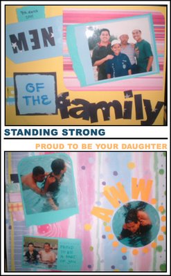
 1. Title: Men of the Family / Subject: My dad and my three brothers / Comment: I don't like this one. What was I thinking, matting the picture with a PINK patterned paper? Sheesh! And the word 'Family' is just too big. :(
2. Title: Aww... / Subject: My Parents / Comment: Love this one. The dots after the 'Aww' is only supposed to be three, four tops but when I did it, I thought it would be better if I did it around the picture. And it turned out good!
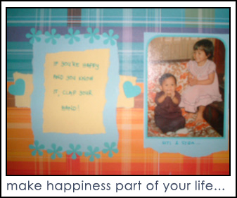
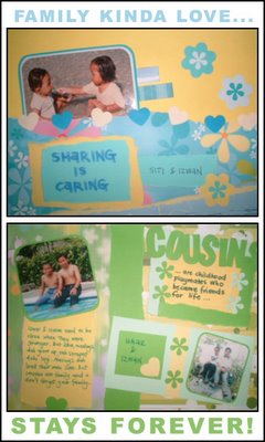
3. Title: If You're Happy and You Know It Clap Your Hands! / Subject: me and my sister, syida / Comment: This is a rework. The layout I did for this picture used to be so hideous I didn't even bother finishing it off. This one turned out okay, I guess. 4. Title: Sharing Is Caring / Subject: Me and my cousin, Izwan, when we were kids / Comments: This is kinda okay. When I did this, I hadn't done any layouts for a while...
5. Title: Cousins / Subject: My younger brother, Umar and our cousin, Izwan / Quote: Cousins are childhood playmates who become friends for life. / Jornaling: Umar and Izwan used to be close when they were younger. But now, masing2 dah grow up, dah tak serapat dulu lagi. Masing2 dah lead their own lives. But cousins are family and you don't forget your family... / Comment: I love this one! Love the quote so much!
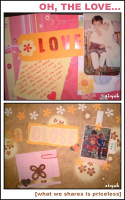
 Two layouts I did of me and my brother.
The journaling in the first one reads: Umar, hari tu lepas tengok cerita CINTA, you asked me whether my love story is in the movie. I said 'no'. You know what? I lied. Of course it's there: the love between a brother and a sister. I love you and don't you ever doubt that, okay?
The second one is hidden in the envelope... I don't really like the way I did the title but this is a nice layout. I love, love the flowers at the top. That's my favourite part...

This is a project I did back in August. This is for my bestfriend, Emeelya. I had fun doing these! For more, you can go here because I can't possibly show everything here right? I can't help thinking that these looked like badges or something. My sister said, in the pictures, it looked like cupcakes...

These are the four cards that I made to give my frens for Friendship Day last August. The first two is simple giler while the last two is more 'complicated' in a sense that I spent a lot of time on those. My most favourite one is the green one but unfortunately it never got sent due to unforeseen circumstances...


In my humble opinion, the best possible way to get ideas for a layout is to look at other people's layouts. You can surf the net or you can buy scrapbook magazines that are available on the newsstands. But I prefer surfing the net to get ideas because those magazines tend to be so pricey, especially because I am on a student loan and students loans are not supposed to be spent on things like that. ;D
The sites that I visited the most are scrapneeds.com.au, scrapbooks.com and scrapspot.com. There are many others, believe me, but these are the ones that I visits frequently.
Go through the gallery to view the layouts. There are countless beautiful layouts out there. What I usually did was look and if I see anything that I like, I try to do a sketch of the layout and try to incorporate that into my own layouts. Sometimes I worry about copying but as I work on my layouts, I didn't end up with the same kind of layout that I based my layout on because every person has their own style, so it's not always the same. So now I don't worry anymore. Plus, I think there's a term in scrapbooking called scraplift where you 'copied' from other people's layout. Correct me if I'm wrong!
I started to be so obsessed with scrapbooking when I stumbled upon this site: scrapneeds.com.au. It was totally random. I don't really know how I got there but it was a link from a totally random blog that I visited. I don't even know what made me so interested to check out the site but there I was, browsing through the galleries, looking at all these beautiful layouts and found myself thinking, "Hey, I want to do that too."
So I did. My first few attempts was far from decent, but it was okay. I'm still learning after all. Gradually, I improved and developed my own style. Now, I make cards and gifts for my family and friends instead of buying them. It feels great! I love what I am doing and I was like, "If only I can do this for a living."
This is how one of my first layout looked like:

